As I’m sure everyone knows, the infamous french designer Yves Saint Laurent died this past Monday, along with the beloved Bo Diddley.

Besides his fashion line, I really didn’t know very much about YSL, until I visited his website and read up a little bit on him. He was an interesting man (born Pierre Berge) – destined to be a fashion designer despite his father’s wishes for him to become a lawyer. He worked under Dior for several years until Dior’s death, afterwhich Yves was put in charge of the house of Dior, and eventually starting his own couture line.

Yves was probably best known for his groundbreaking smoking suit fashions in the mid-sixties. These women’s suits were designed to resemble men’s tuxedos and formalwear. Dressing women up in this sort of decidely masculine attire had never been done to this extreme.

Below are examples of YSL’s smoking suits, as well as the iconic Yves Saint Laurent logo and perhaps the most well-known photograph of a Yves Saint Laurent creation. For more info on YSL, visit ysl-hautecouture.com.

I am a HUGE mid-century modern fan. The music, the architecture, the interior design. From time to time I peruse the eBay listings for home decorating magazines from this era, and delight in the both the genius and wackiness that defined the time. I also revel in how much current interior decorating trends mimic this era. Here are some fun examples:

helvetica font
I just wanted to write a quick post. I’m currently watching the movie Helvetica and it has woken me up from my design slumber. Whether you are a designer or not, this movie is inspiring and informative. It reminds me of the wealth of knowledge that you learn in school and how easily it is to become lost in the day-to-day design world. As a designer, it’s a must-see. As a non-designer, it’s will help you understand how ‘the designer’ thinks.
Get it now, visit: helveticafilm.com.

Killer work by Marian Bantjes

I’m not really sure how I came upon this uber-talented designer, surfing around on the net. But when I did, she just plain blew me away. Simply amazing typographical/calligraphical (is that a word?) work. It’s heavenly. This is this sort of stuff that makes me spiral into a hole of self-loathing. And rightly so – this chick ROCKS. For a larger look at her sheer genius, visit her website: bantjes.com.

Remember those lame psychic cards that Dr. Venkman used to woo his student at the beginning of Ghostbusters? They looked like this:

zener cards

Turns out they’re called “Zener cards,” and I’ve found that, whenever my brain is stuck on what to try next with a layout, thinking of these cards can be darn helpful. They’re especially helpful when photos, themes, and other useful content are unavailable or non-applicable. They help get my brain back to some fundamental building blocks that I can lean on for support in time of need. If you’ve ever needed to “design in a vacuum,” you know what I mean.

Here’s a typical example. Last week, my employer (Level 3) asked me to come up with a design for a vinyl pull-up banner-stand that would be ported around to various trade shows for the next couple years. In order to serve strictly as a corporate identifier that could retain compatibility with any show we might attend, the banner-stand would have to rely strictly on our limited palette of three corporate colors (two of which are black and “silver,” ha!), the Level 3 logo, and not much else. No photos, no text, nothing too fun. This needed to be as generic as humanly possible for maximum compatibility with a maximum number of trade shows.

It crossed my mind to just slap the logo on there and call it done, but our logo is *very* horizontal, and these banner-stands are *very* vertical. What to do? Zener cards to the rescue!

L3 bannerEnvisioning the “cross” or “plus” shape in the Zener cards reminded me that pesky vertical shapes can be broken up into sections to accommodate horizontal regions. And the circle reminded me that Level 3 had recently adopted “the iconic circle” as one of its corporate identity elements. Meanwhile, the shapes added altogether reminded me that background textures need not be based in photography… The backgrounds themselves can consist of iconic shapes, too, with gentle changes in color applied to create a texture.
So there you have it.

All the reviewers liked it. Done! Thanks Mr. Zener!

part. 1

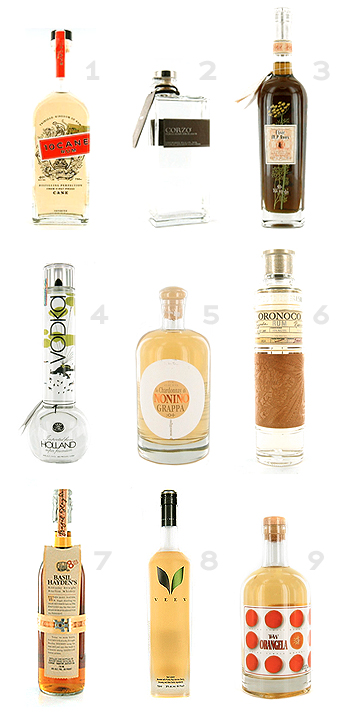
Ever notice how extremely cool some liquor bottles are? If you’re a fellow designer, you’re bound to. Unfortunately this also means you might fall into the trap of, “Oh wow, this bottle is so cool. That’s gotta mean the booze tastes just as good!” Yeah. Been there, done that. Got rid of the bottle.

Anywho, keeping in mind that yes, some of these fine elixirs may not be fine at all, here are some super cool liquor bottles that grace the shelves of such establishments as Total Beverage, Argonaut Liquor and Applejack Liquors here in Denver, Colorado. This is the first part of a two-part blog. (sidenote: some of these bottles actually cost more than the blue book of my car at present, so go figure)

booze.jpg

{1} 10 Cane Rum
– love the type treatment and decorative embellishments, as well as the colors
{2} Corzo Tequila Silver
– usually I don’t like liquor bottles that resemble perfume bottles, but this one is nice, especially with the rectangular shape and the offset neck
{3} Elisir M P Roux (an appertif)
– unfortunately you can’t see the beautiful artwork on the front, but this bottle
boasts a delicate floral illustration behind the label
{4} Bong Spirit Vodka
– I think we all know why I like this one
{5} Nonino Grappa Chardonnay
– great bottle shape and fantastic type treatment; good balance
{6} Oronoco Rum
– how can anyone not like a bottle wrapped in a piece of buckskin leather?
the type treatment on this rounds out an overall fantastic design
{7} Basil Hayden’s Bourbon
– another bottle with bling – this baby is wrapped in paper and copper,
and finished off with two fat serif initials. the label is a little weird – at the top it’s
more wide and isn’t glued to the bottle; still a very cool design
{8} Veev Acai Liqueur
– very simple, clean, yet striking design. the logo is really what makes it
{9} Orangela Liqueur (made in Florida)
– this is the type of bottle that jumps out at you off the shelf. bright color,
interesting shapes; basically just fun

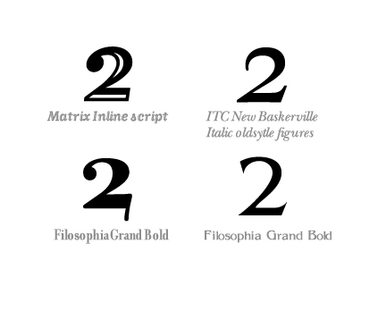
I’m in the middle of designing a magazine cover for a possible upcoming DNA publication, and I’m trying to implement the number two in the header rather than spelling it out with type. As a result, finding an attractive “2” has become somewhat challenging. I’ve narrowed it down to the following:

twos.jpg

While not particularly attractive as body fonts, these families offer interesting takes on the number 2. As of this moment, I’m leaning toward the Filosophia Grand Bold option. Though now, I’m also reconsidering spelling out “second” rather than using numbers. Hmmm…..

Welcome to Design Geeks!

Design Geeks is a daily commentary blog about graphic design. Erin and Dave, Design Geeks contributors, will be trying their darndest to make daily posts about things that inspire them, annoy them, or make them feel all fuzzy. Or hairy. So check back often to see what has recently caught their eye. And always feel free to comment.

GEEK SPEAK

Do you remember who designed the infamous "I (Heart) NY" logo? Yup, that's right. It was Milton Glaser.